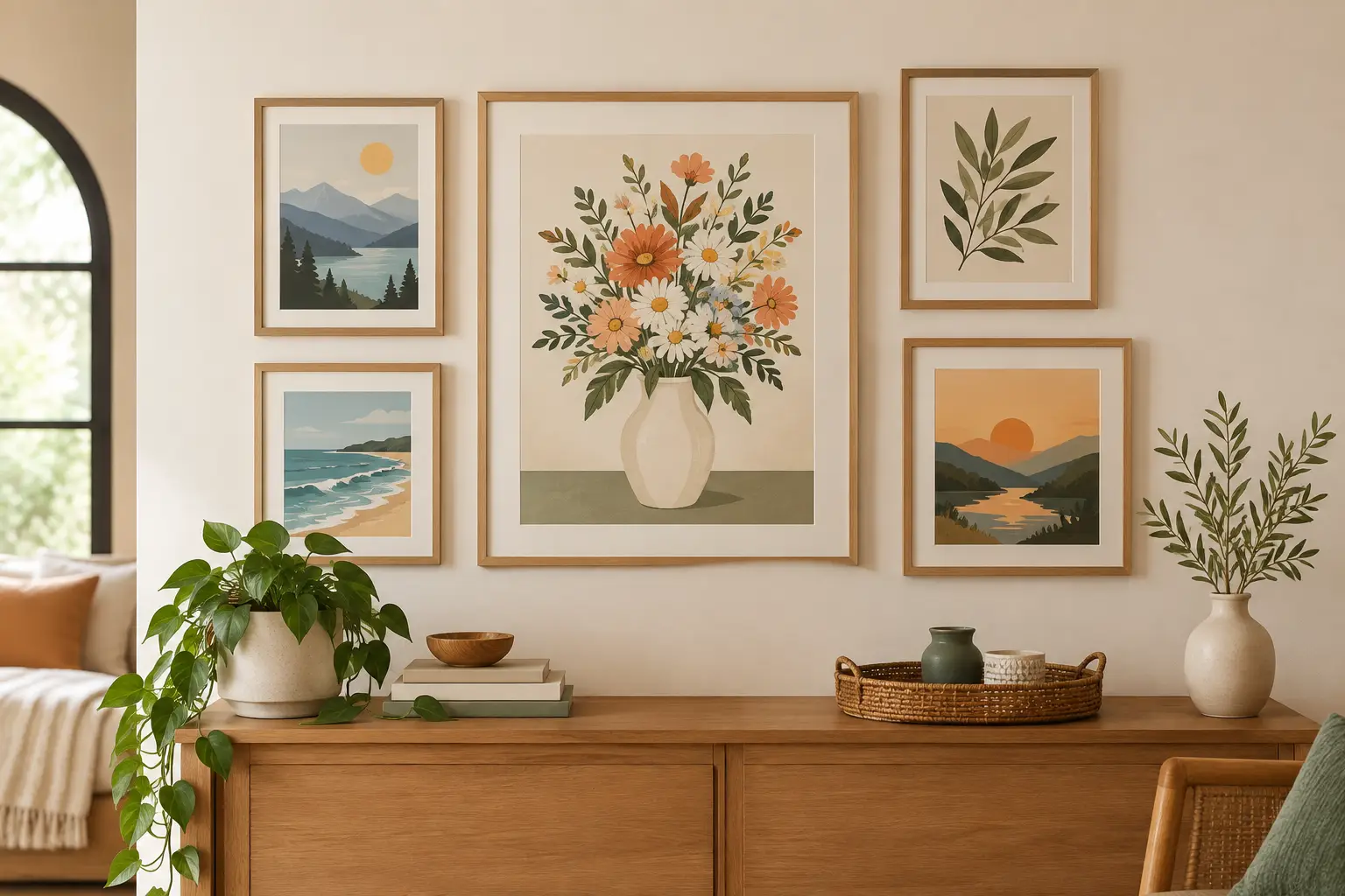
A beautiful print can get lost surprisingly fast when it is taped to a wall, placed too high above a sofa, or tucked into a frame that fights with the artwork. To display art prints well, think of them as part of the room’s collected story. A coastal wave, a watchful heron, or a Texas landscape deserves a place where its color, texture, and sense of place can be enjoyed every day.
The best arrangement is rarely the most formal one. It is the one that feels at home with the objects around it: a hand-glazed spoon rest in the kitchen, a leafy planter on the sill, a favorite shell from a beach trip, or a whimsical ceramic dragon watching over a bookshelf. Prints bring a little breathing room to those collections, adding mood without taking up another inch of tabletop space.
Start With the Room’s Feeling
Before choosing a frame or reaching for a hammer, notice what the room already wants to be. A sunlit living room with warm woods, woven baskets, and green plants may call for wildlife or landscape prints with soft, natural color. A bathroom or entryway can carry a small coastal image beautifully, especially when the print echoes the blue-green glow of sea glass or the sandy warmth of a ceramic shell dish.
Fantasy art and bold animal imagery can be more playful. A dragon print above a reading chair or a curious woodland creature in a child’s room gives the space a spark of storybook personality. The trick is not to match every color perfectly. Instead, repeat one or two elements – perhaps the rust tone in a sunset print or the mossy green of a forest scene – somewhere nearby in a pillow, planter, or piece of pottery.
Prints also work wonderfully in rooms that feel a little too polished. A handmade home is allowed to have surprises. One moody photograph beside a cheerful gnome figurine or a little castle sculpture can make a shelf feel collected rather than staged.
Choose the Right Scale Before You Frame
Scale is where many display decisions go sideways. A small print floating alone over a long sofa tends to feel accidental, while an oversized piece in a narrow hallway can make the walls feel crowded. There is no single correct formula, but proportion gives you a strong starting point.
Above furniture, aim for artwork that fills roughly two-thirds to three-quarters of the furniture’s width. That does not mean one huge print is your only option. Two or three coordinating prints can create the same visual weight while leaving room for variety. A pair of coastal photographs above a console, for example, can feel calm and balanced without becoming too formal.
For a small print, intimacy is its strength. Place it where someone naturally pauses: beside a bedside table, above a kitchen coffee station, near a reading nook, or in a little gallery above a desk. Smaller pieces reward close looking, particularly nature photography with feathers, bark, water, clouds, and other lovely details.
When hanging art above a sofa, headboard, or buffet, keep the bottom edge about 6 to 10 inches above the furniture. On an open wall, the center of the artwork usually looks most natural at about 57 to 60 inches from the floor. These are guides, not rules. If your household includes tall furniture, lively dogs, curious kids, or a low, cozy seating arrangement, adjust for the room you actually live in.
Display Art Prints With Frames That Add Character
A frame should support the art, not swallow it. Simple wood frames are especially friendly to nature, wildlife, and landscape prints because their grain adds warmth without competing with the image. Light oak feels airy and coastal; walnut brings depth to dramatic scenes; black frames make color photography feel crisp and contemporary.
White or cream mats give a print room to breathe and can make a modestly sized piece look more intentional. This is useful for a small print displayed on a larger wall. On the other hand, an edge-to-edge frame can feel modern and direct, especially for bold images or a tightly arranged gallery wall.
You do not need every frame in a room to match. In fact, a blend of wood tones and a few painted or metal frames can make a collection feel gathered over time. Keep one element consistent, such as similar mat colors, a repeated frame finish, or a shared subject matter. That bit of repetition helps an eclectic display look thoughtful rather than scattered.
If the print is going near a sunny window, consider UV-protective glazing. Direct sunlight can fade color over time, even in a room that feels bright and cheerful. A protected print will keep its sky blues, deep greens, and sunset colors truer for longer.
Let a Gallery Wall Tell a Small Story
Gallery walls are most successful when they have a point of view. Rather than filling space with unrelated images, choose a loose thread. It might be coastal birds, quiet Texas roads, woodland animals, favorite travel moments, or a blend of nature prints and small handmade objects.
Lay everything out on the floor first. Move pieces around until the spacing feels easy on the eye, generally keeping 2 to 3 inches between frames. Start with the largest print, then build outward. A grid suits a clean, orderly room, while an organic cluster feels more at home in a creative corner filled with plants, pottery, and books.
A gallery wall does not have to be all frames. A shallow shelf can hold a framed print layered behind a small ceramic planter, a tiny sculpture, or a dish that catches keys and sea-polished stones. Be careful not to cover the heart of the image. Layering should create depth, not hide the artwork you chose to enjoy.
Give Prints a Job in Everyday Spaces
Art does not need to be reserved for the living room. A print in the kitchen can soften hardworking surfaces and make the morning routine nicer. Choose a spot away from steam and splatters, such as above a breakfast nook or on a wall near the pantry. A small landscape or bird photograph can make a practical space feel less utilitarian.
In a plant corner, art can help turn a group of pots into a real indoor garden moment. A leafy botanical scene, a wildlife print, or a misty forest photograph creates a backdrop for bonsai trees and houseplants without trying to outshine them. Leave enough open wall around the print so both the foliage and the image have room to be seen.
Entryways are another fine place for art. They set the tone before anyone reaches the couch. One well-framed coastal print above a small table, paired with a handmade trinket dish for keys, is simple but full of welcome. If your entry is narrow, choose a vertical print to draw the eye upward.
Use Light Kindly
Lighting changes art more than most people expect. A print that seems quiet in the afternoon can come alive under a warm picture light or nearby lamp at night. Soft, warm bulbs tend to flatter landscapes, wood frames, and handmade ceramics. Very cool lighting can make a welcoming room feel a little clinical.
Avoid placing prints directly opposite a bright window if glare is a problem. Shift the piece to an adjacent wall, use non-glare glazing, or rely on a lamp to give the artwork its own gentle pool of light. The goal is not a museum spotlight. It is simply making the image easy to enjoy.
About the Artist
Billy Williams is the artist behind Billy’s Creations TX, where he creates handcrafted ceramics, bonsai pots, wildlife photography, and other original artwork. To see more of his work or browse available pieces, visit https://billyscreationstx.etsy.com.
A print earns its place when it makes you pause, remember, or imagine something beyond the wall. Hang the piece you love where your eyes naturally land, then let it share the room with the handmade objects and everyday rituals that make your home yours.